Die Marke zum Mitnehmen.
Logos in jedem Format, die Farben mit einem Klick, die Schriften, und eine DESIGN.md, die du direkt an einen Coding-Agent weitergeben kannst.
Alles auf einmal.
Alle Logo-Dateien, alle Favicons und die DESIGN.md in einem ZIP.
Wortmarke und Bildmarke.
Das Logo ist typografisch: GudeCode in Manrope ExtraBold, dahinter ein blaues Quadrat, das auf der Grundlinie sitzt. Alle SVGs enthalten Konturen statt Text — sie brauchen die Schrift nicht.









Schutzraum und Mindestgröße.
Ringsum bleibt mindestens die Höhe des blauen Quadrats frei — kein Text, kein Bildrand, kein anderes Logo. Die gestrichelte Fläche ist der Schutzraum, nicht Teil der Datei.
Mindestgröße
- Digital
- 120 px
- Druck
- 30 mm
- Bildmarke
- 24 px
Das Quadrat
0,34 em Kantenlänge, 0,10 em Abstand zum letzten Buchstaben, Unterkante exakt auf der Grundlinie. Nie zentriert, nie schwebend.
Favicons und App-Icons.
Die Bildmarke in allen Größen, die Browser und Betriebssysteme verlangen — inklusive Web-Manifest.


Eine laute Farbe. Sonst nichts.
Klick auf einen Wert, um ihn zu kopieren — Hex für Design-Tools, CSS-Variable für den Code.
Kern
Ink und Paper tragen die ganze Seite. Blau ist die einzige laute Farbe und heißt immer: hier passiert etwas, oder das sind wir.
Flächen & Linien
Die Haarlinie ist die meistgenutzte Nicht-Textfarbe im System — sie ersetzt Schatten als Strukturmittel.
Kampagne
Amber und Cyan gehören der Werbung, nicht dem Produkt. Zwei laute Farben auf einem Screen nehmen dem Blau seine Bedeutung.
Dark Mode
Der Grund kippt, nicht die Palette. Blau wird eine Spur heller, damit es auf Schwarz trägt.
Gemessener Kontrast
Zwei Schriften, mehr nicht.
Manrope für alles, IBM Plex Mono für alles Wörtliche — Domains, Adressen, Code. Beide selbst gehostet, keine Anfrage an Dritte.
Kanten statt Schatten.
Struktur kommt aus Haarlinien und harten Kanten. Radius bleibt den Bedienelementen vorbehalten.
So ja. So nicht.
Bitte so
- Blau für genau eine Sache pro Ansicht — die, die geklickt werden soll.
- Raster als gap-px über einem Border-Grund bauen, damit die Linien jeden Umbruch überleben.
- Vollbreite Flächen mit negativem Container-Margin bis auf die Rails ziehen.
- Farben als background/foreground-Paare definieren, dann folgt Dark Mode von selbst.
- Schutzraum: rundum mindestens die Höhe des blauen Quadrats freihalten.
Bitte nicht
- Keine Schatten auf Karten oder Buttons, um Hierarchie zu erzeugen — nimm eine Linie.
- Nichts runden, was kein Bedienelement ist. Keine Pillen.
- Die Wortmarke nicht neu setzen, nicht sperren, nicht verzerren, nicht neigen.
- Das Quadrat nicht von der Grundlinie lösen und nicht einfärben außer Blau, Schwarz oder Weiß.
- Amber und Cyan nicht im Produkt-UI verwenden.
- Keine Fläche auf festen hellen Farben bauen — sie kippt im Dark Mode falsch.
Für jeden Kanal.
Alle Formate, die Facebook, Instagram, LinkedIn, YouTube und TikTok verlangen — aus derselben Quelle wie das Logo erzeugt. Dateien, die überall gleich sind, stehen genau einmal hier.
Link-Vorschau je Seite
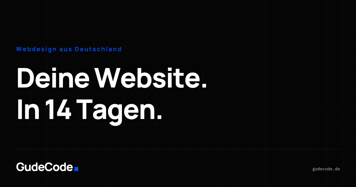
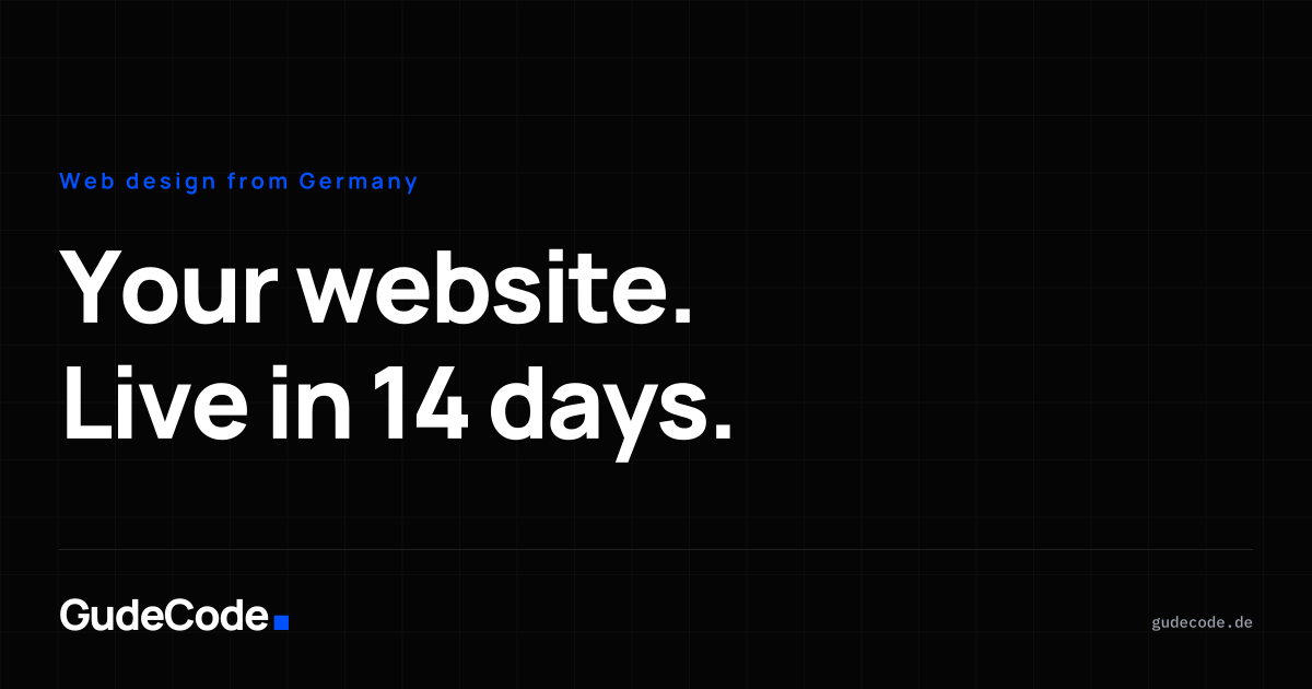
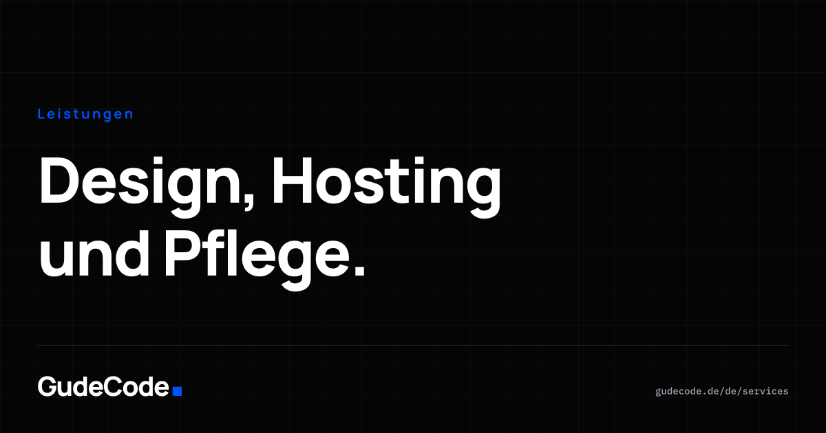
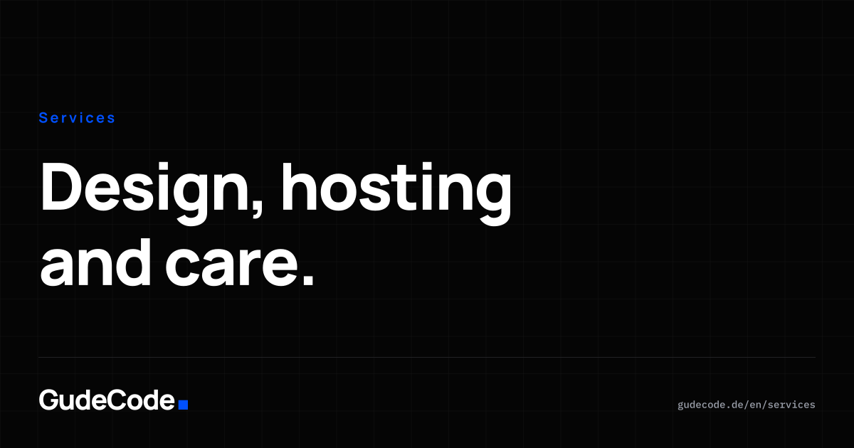
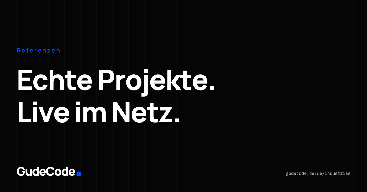
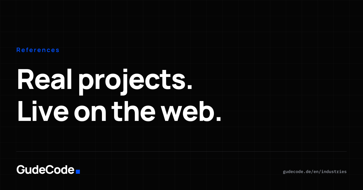
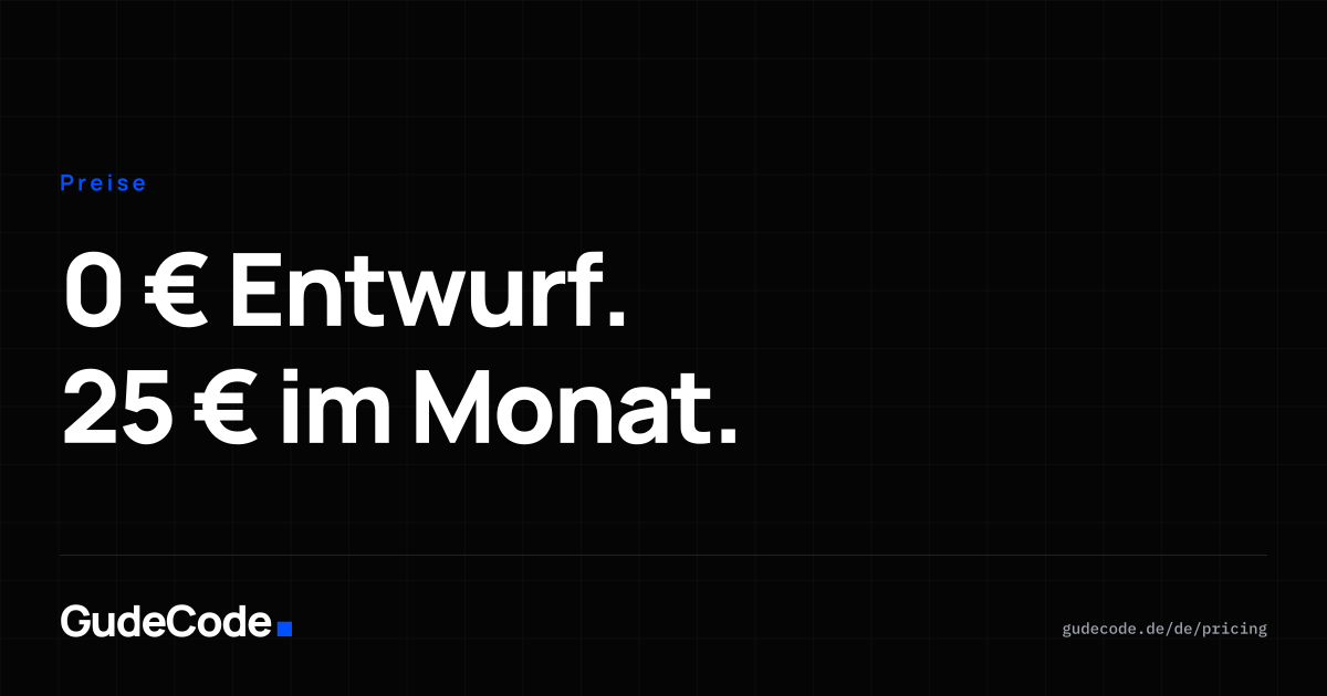
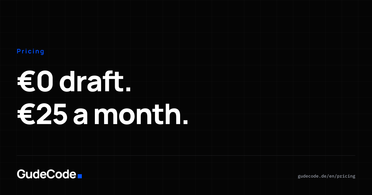
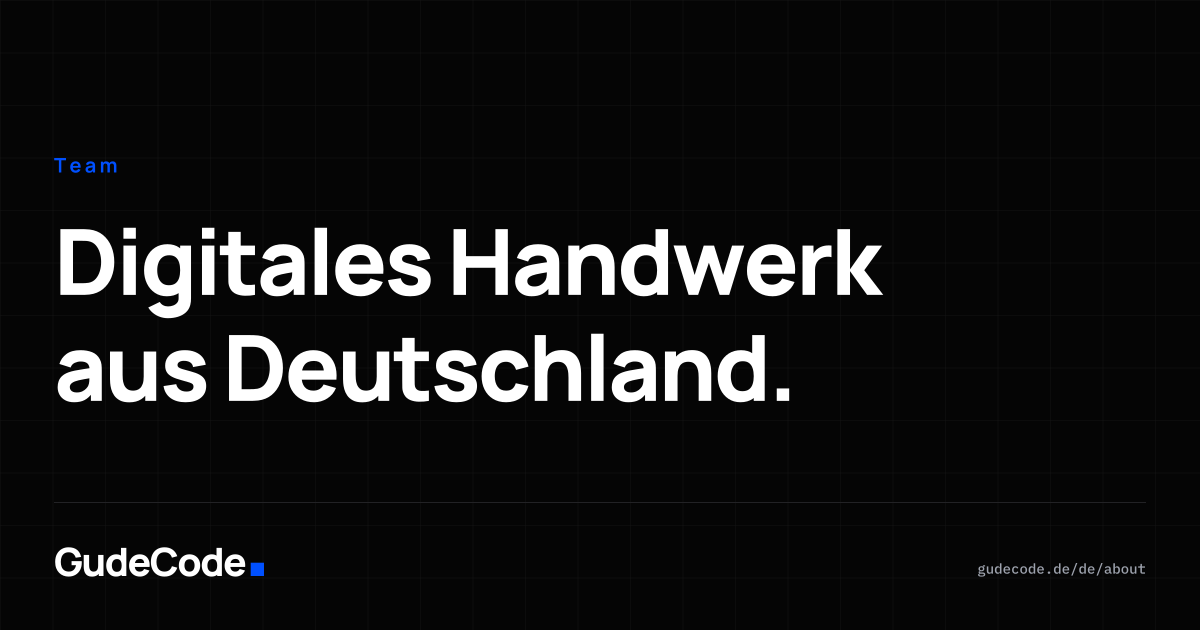
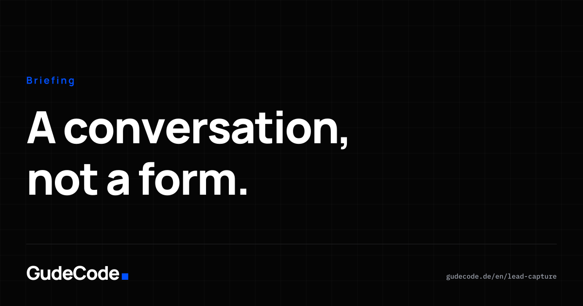
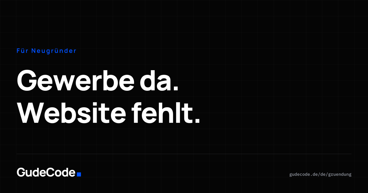
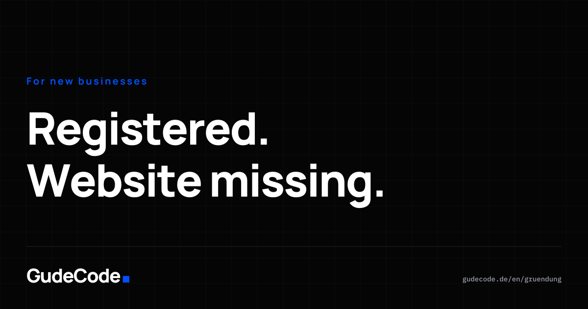
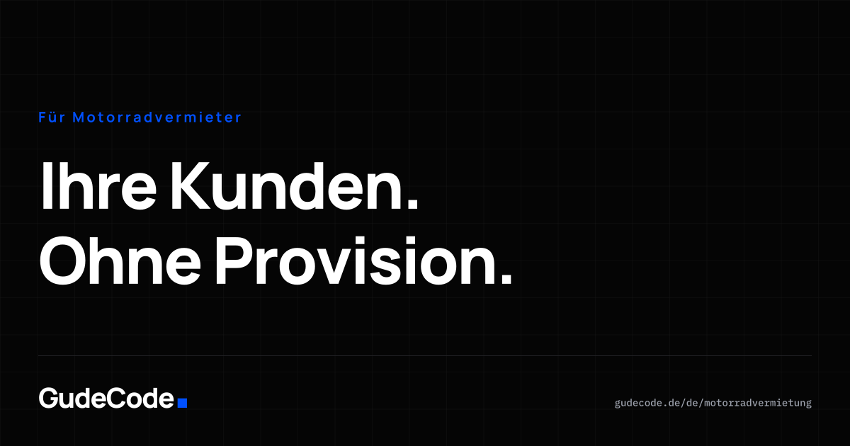
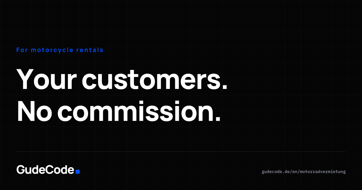
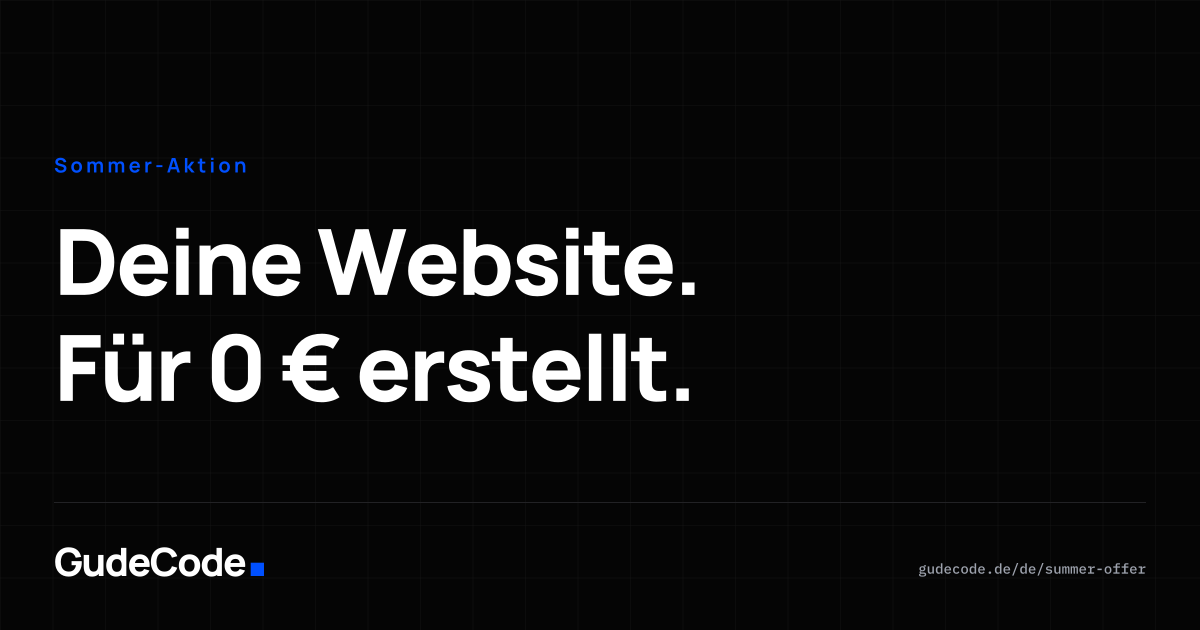
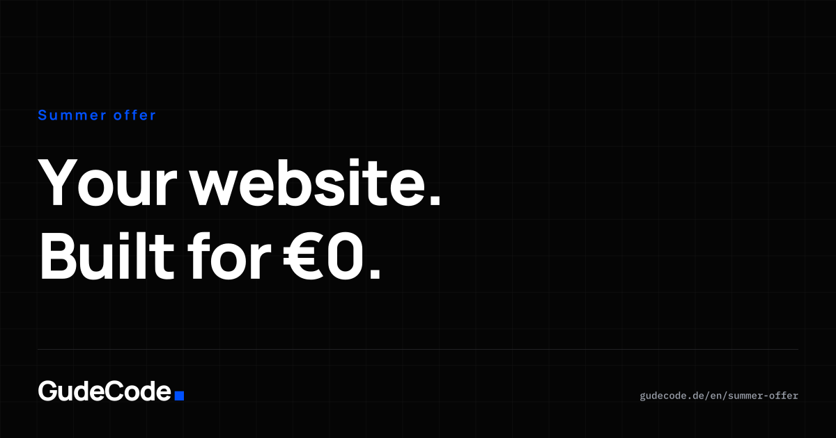
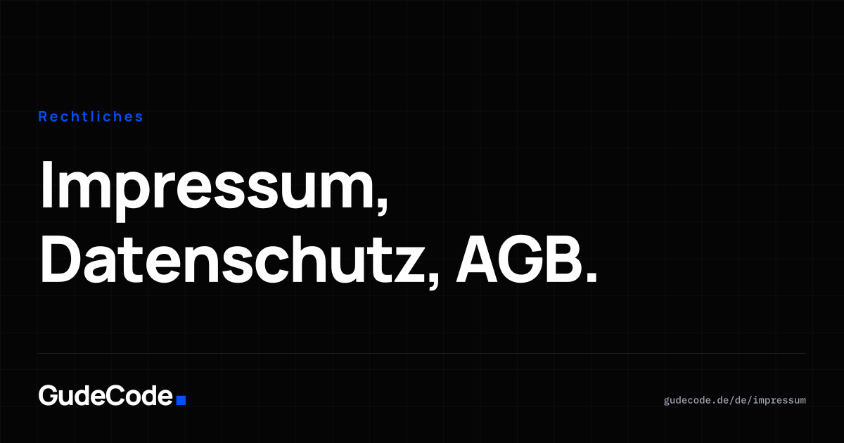
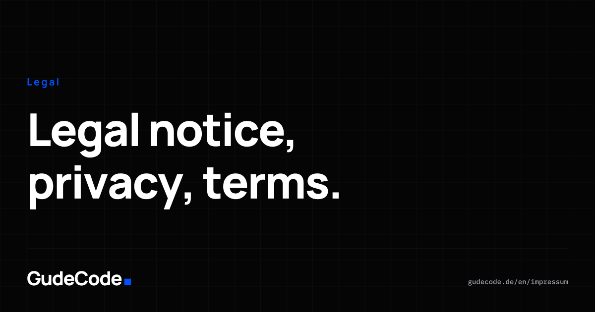
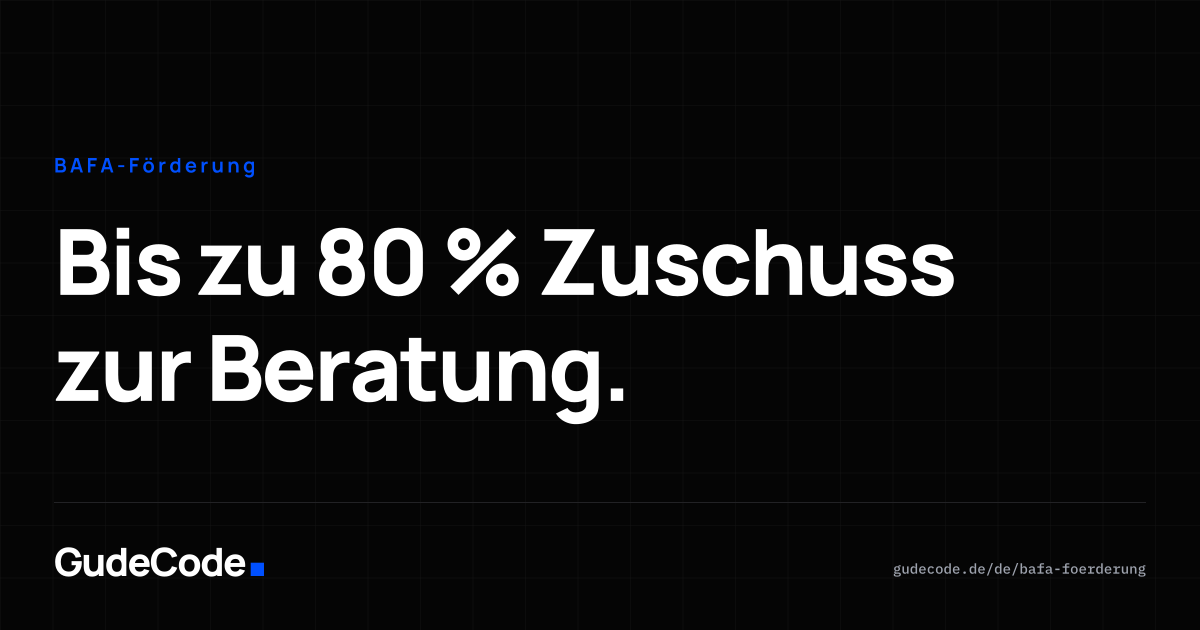
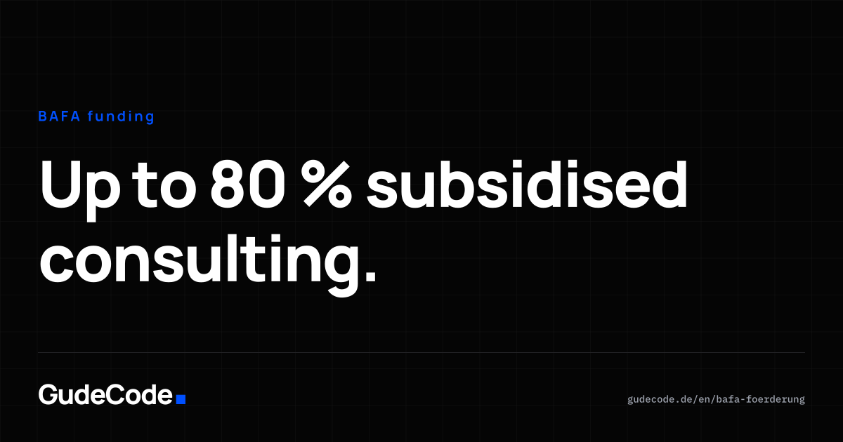
Was erscheint, wenn jemand eine Seite von gudecode.de teilt. Jede Seite hat ihre eigene Karte, jede Karte gibt es auf Deutsch und Englisch — der og:image-Tag wählt automatisch nach Pfad und Sprache. Erzeugt aus src/content/og-pages.json mit scripts/build-og-images.py.
























Für alle Kanäle
Ein Profilbild reicht für fünf Plattformen, und ein 9:16-Format ist Story, Reel, TikTok und Short zugleich. Deshalb steht jede Datei hier nur einmal.
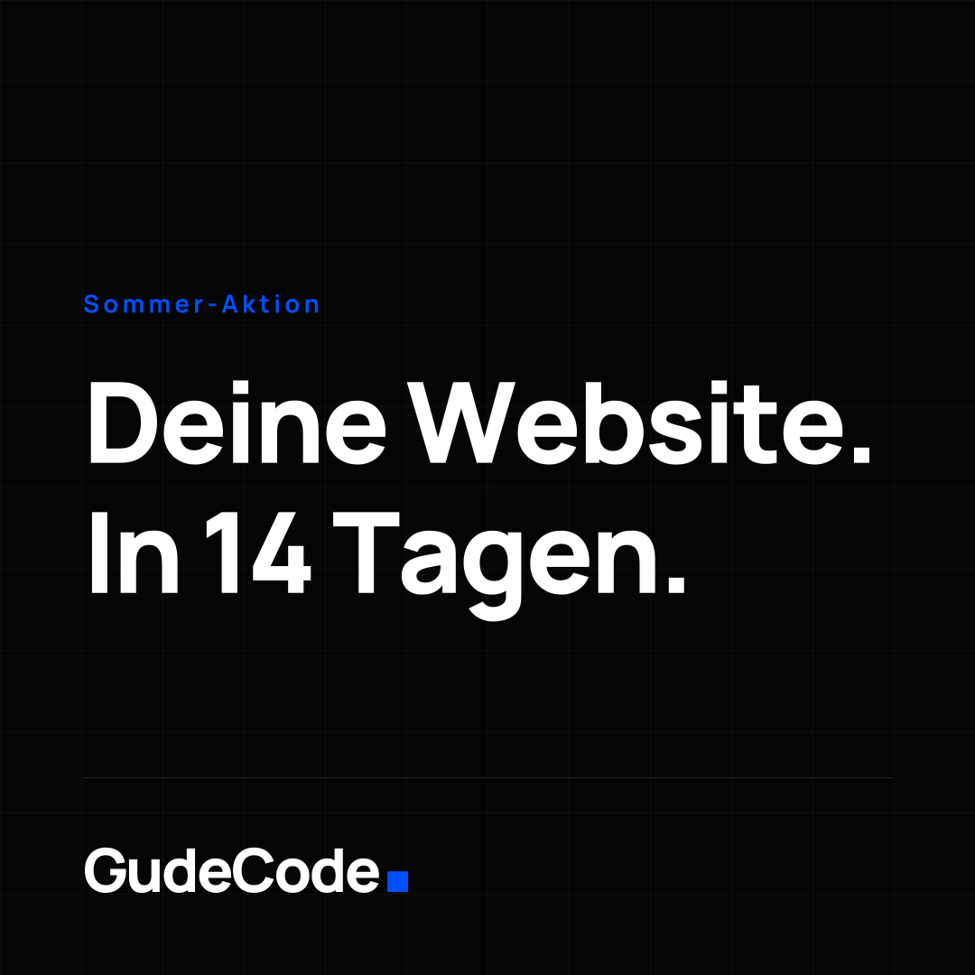
Ein Bild für alle Kanäle. Wird überall rund beschnitten — die Marke sitzt mittig.
Sicher: Kreis-Zuschnitt PNG 1080 × 1080
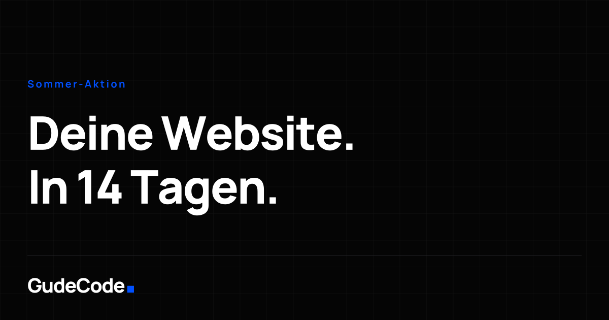
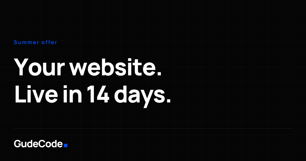
Für Beiträge und Anzeigen im Link-Format. Die Link-Vorschau der Website liegt separat unter /og/.
PNG 1200 × 630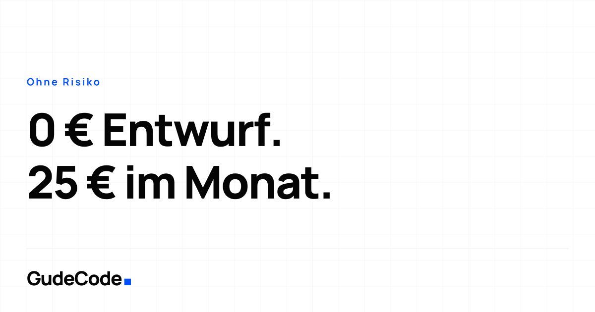
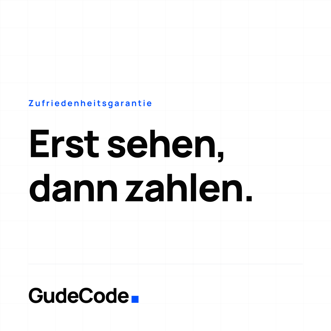
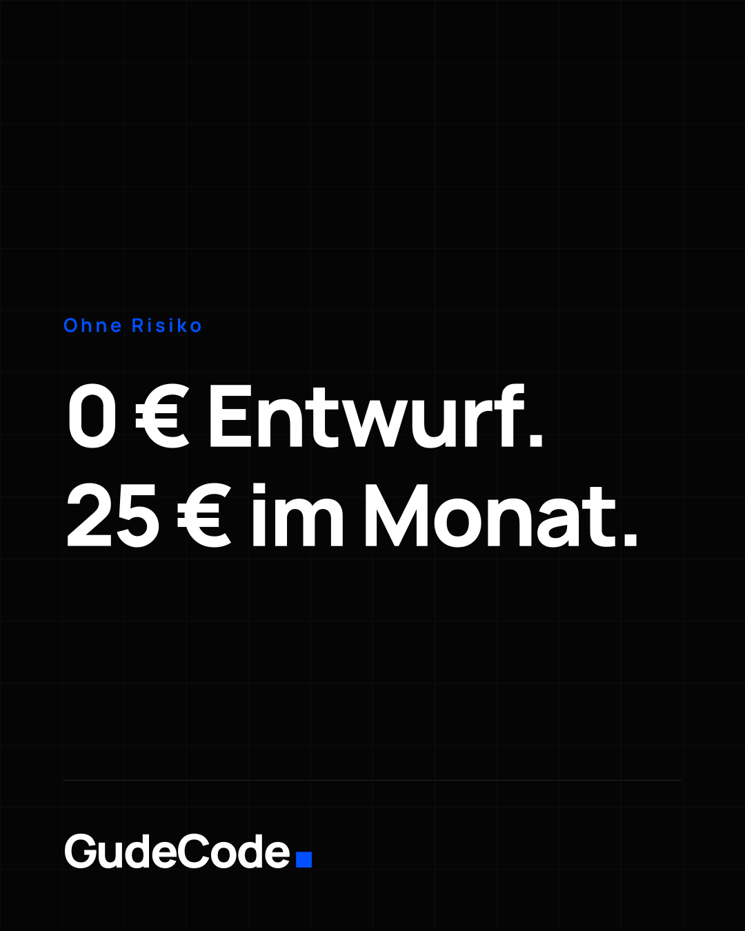
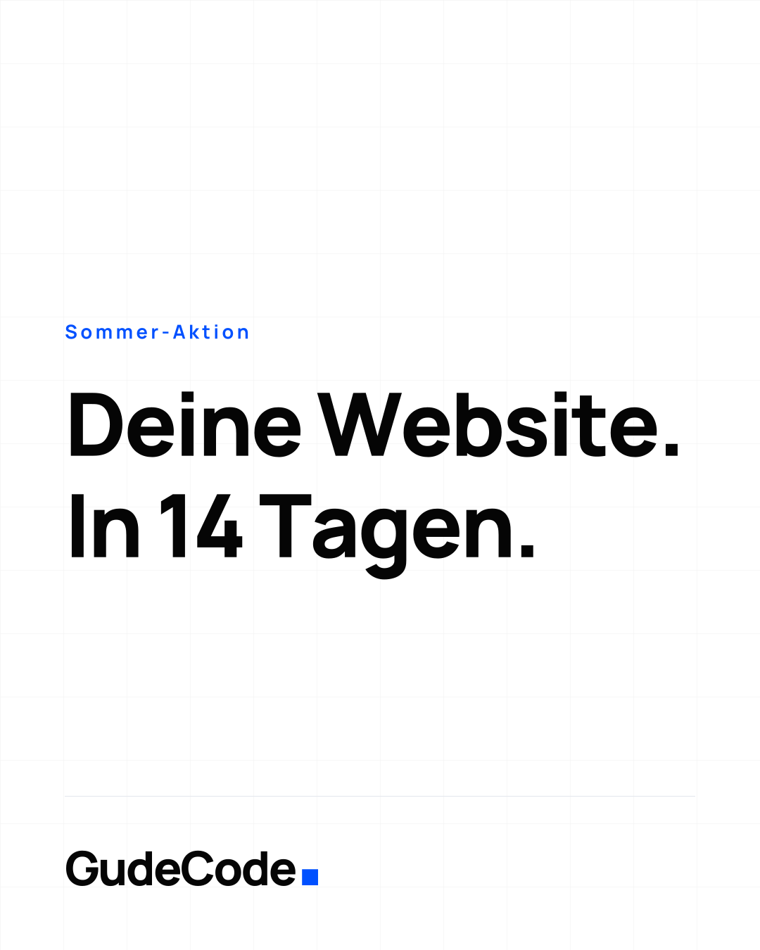
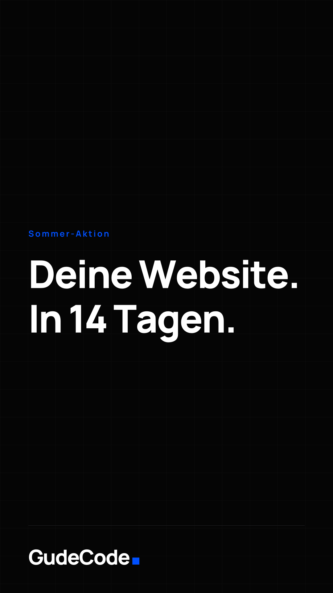
9:16 für Instagram- und Facebook-Story, TikTok und YouTube Shorts.
Sicher: Oben und unten je 250 px frei halten PNG 1080 × 1920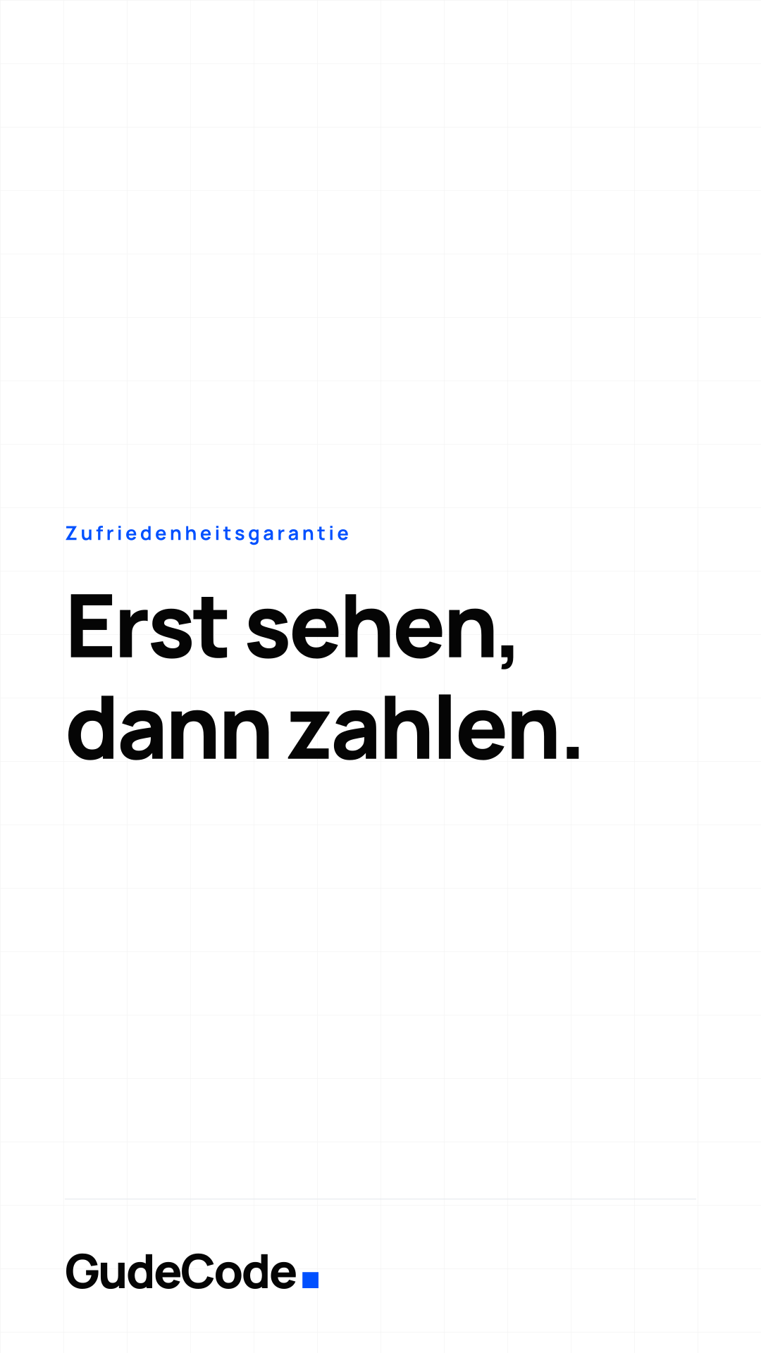
Pro Kanal
Facebook zeigt am Desktop 820 × 312 daraus — alles Wichtige liegt darin.
Sicher: 820 × 312 mittig PNG 1640 × 856Websites für kleine und mittlere Unternehmen. Kostenloser Entwurf, live in 14 Tagen, 49,90 € im Monat — monatlich kündbar. Digitales Handwerk aus Deutschland.
Websites für dein Business. Kostenloser Entwurf · live in 14 Tagen · 49,90 €/Monat Made in Germany 🇩🇪

Für persönliche Profile im Team.
Sicher: Links unten liegt das Profilbild PNG 1584 × 396Websites für KMU. Kostenloser Entwurf, live in 14 Tagen, 49,90 €/Monat, monatlich kündbar.
YouTube
3 eigene · 2 geteilte Dateien
YouTube zeigt je nach Gerät nur einen Ausschnitt — die Marke liegt im TV-sicheren Bereich.
Sicher: 1546 × 423 mittig PNG 2560 × 1440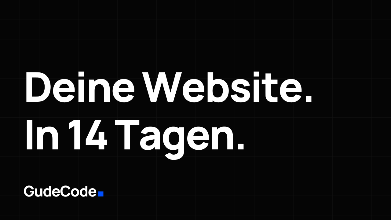
Wird oft 210 px breit gelesen — deshalb läuft die Schrift so groß.
PNG 1280 × 720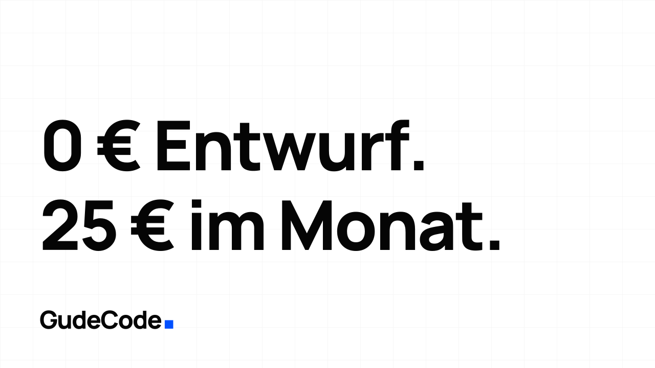
GudeCode baut Websites für kleine und mittlere Unternehmen in Deutschland. Wir bauen deine Website zuerst und zeigen sie dir fertig. Gefällt sie dir, geht sie innerhalb von 14 Tagen live — für 49,90 € im Monat, inklusive Hosting, Pflege, Sicherheits-Updates und Support. Keine Anzahlung, keine Mindestlaufzeit, monatlich kündbar. Rechtssichere Texte mit eRecht24, professionelles Cookie-Consent-Management und SSL sind von Anfang an dabei. gudecode.de
TikTok
Nutzt 2 geteilte DateienWebsites für dein Business · 0 € Entwurf · live in 14 Tagen · gudecode.de
Für Coding-Agents.
Das ganze System als eine Datei im DESIGN.md-Format von Google Labs: Tokens als YAML im Front Matter, die Begründung als Markdown darunter. Kopieren, in ein Repo legen oder direkt in den Kontext eines Agents geben.
---
version: alpha
name: GudeCode
description: >-
  Bordered-grid design language for gudecode.de — hairline rules, near-square
  corners, one loud blue on an otherwise achromatic page. German digital
  craft studio for small and medium businesses.
colors:
  ink: "#050505"
  paper: "#FFFFFF"
  primary: "#0050FF"
  primaryHover: "#0040CC"
  primaryTint: "#EDF3FF"
  accent: "#FFAD00"
  cyan: "#00E0FF"
  border: "#E3E7ED"
  muted: "#F3F4F8"
  mutedForeground: "#686F7D"
  destructive: "#EF4444"
  darkBackground: "#050505"
  darkForeground: "#FAFAFA"
  darkCard: "#0C0C0E"
  darkBorder: "#222225"
  darkMutedForeground: "#9EA3AE"
  darkPrimary: "#1A62FF"
typography:
  display:
    fontFamily: Manrope
    fontSize: 3.75rem
    fontWeight: 800
    lineHeight: 1
    letterSpacing: -0.03em
  h1:
    fontFamily: Manrope
    fontSize: 3rem
    fontWeight: 800
    lineHeight: 1.05
    letterSpacing: -0.03em
  h2:
    fontFamily: Manrope
    fontSize: 1.875rem
    fontWeight: 800
    lineHeight: 1.1
    letterSpacing: -0.03em
  h3:
    fontFamily: Manrope
    fontSize: 1.25rem
    fontWeight: 800
    lineHeight: 1.2
    letterSpacing: -0.03em
  body-lg:
    fontFamily: Manrope
    fontSize: 1.125rem
    fontWeight: 500
    lineHeight: 1.65
  body-md:
    fontFamily: Manrope
    fontSize: 1rem
    fontWeight: 500
    lineHeight: 1.65
  body-sm:
    fontFamily: Manrope
    fontSize: 0.875rem
    fontWeight: 500
    lineHeight: 1.6
  label-caps:
    fontFamily: Manrope
    fontSize: 0.65rem
    fontWeight: 700
    letterSpacing: 0.18em
  mono:
    fontFamily: IBM Plex Mono
    fontSize: 0.75rem
    fontWeight: 500
  wordmark:
    fontFamily: Manrope
    fontSize: 2rem
    fontWeight: 800
    letterSpacing: -0.04em
rounded:
  none: 0px
  sm: 2px
  md: 4px
  lg: 6px
  full: 9999px
spacing:
  hairline: 1px
  xs: 4px
  sm: 8px
  md: 16px
  lg: 24px
  xl: 32px
  section: 80px
  sectionLg: 112px
  containerMax: 1400px
  gutter: 20px
  gutterLg: 32px
components:
  button-primary:
    backgroundColor: "{colors.primary}"
    textColor: "{colors.paper}"
    typography: "{typography.body-sm}"
    rounded: "{rounded.lg}"
    padding: 12px 24px
  button-primary-hover:
    backgroundColor: "{colors.primaryHover}"
    textColor: "{colors.paper}"
  button-outline:
    backgroundColor: transparent
    textColor: "{colors.ink}"
    rounded: "{rounded.lg}"
    padding: 12px 24px
  card:
    backgroundColor: "{colors.paper}"
    textColor: "{colors.ink}"
    rounded: "{rounded.none}"
    padding: 24px
  chip:
    backgroundColor: transparent
    textColor: "{colors.mutedForeground}"
    typography: "{typography.body-sm}"
    rounded: "{rounded.none}"
    padding: 4px 8px
  eyebrow:
    backgroundColor: "{colors.paper}"
    textColor: "{colors.mutedForeground}"
    typography: "{typography.label-caps}"
    rounded: "{rounded.none}"
    padding: 4px 10px
  input:
    backgroundColor: "{colors.paper}"
    textColor: "{colors.ink}"
    rounded: "{rounded.lg}"
    height: 40px
    padding: 8px 12px
  brand-square:
    backgroundColor: "{colors.primary}"
    rounded: "{rounded.none}"
    size: 0.34em
---

## Overview

GudeCode builds websites for small and medium businesses in Germany: free
first draft, live in fourteen days, cancellable monthly. The design language
has to look like that promise — plain, structural, nothing decorative that
would have to be paid for later.

The system is a **bordered grid**. Structure is carried by hairline rules and
squared corners rather than by shadow, gradient or rounding. Two vertical
rules — the *rails* — run the full height of the page at the container edge,
and every section aligns its content to them. Cells inside a section are
separated by 1px gaps over a border-coloured backing, so a grid stays correct
at every wrap point without a single rule going astray.

The page is achromatic apart from one electric blue. Blue means *action or
identity* — a link, a primary button, the brand square, the active state.
Nothing else is blue. When everything is grey and black, a single blue element
is impossible to miss, which is the whole point.

The tone is German plain-speech: short sentences, no agency vocabulary, prices
and terms stated exactly. Copy is written in German first and translated to
English, never the reverse.

## Colors

Achromatic ground, one accent, and a warning colour used sparingly.

- **Ink (#050505):** Near-black for all body and heading text. Not pure black —
  #000 on a bright screen is harsh and reads as unrendered.
- **Paper (#FFFFFF):** The page. Cards sit on it at the same value and are
  separated by rules, not by tint.
- **Primary (#0050FF):** Electric blue. Links, primary buttons, the brand
  square, active tabs, focus rings, the accent hairline in a highlighted
  column. One job: *this is interactive, or this is us.*
- **Primary hover (#0040CC):** The pressed/hover step, never used as a resting
  colour.
- **Primary tint (#EDF3FF):** Quiet blue surface for secondary buttons and the
  highlighted column of a comparison table. Carries no text of its own beyond
  the ink already on the page.
- **Accent (#FFAD00):** Amber, for the recurring offer bar and campaign
  material only. It never appears in product UI — two loud colours competing
  on one screen destroys the blue's meaning.
- **Cyan (#00E0FF):** Deliberate highlight in campaign artwork. Never a
  surface, never a shadcn `accent`.
- **Border (#E3E7ED):** Every hairline. The single most-used non-text colour
  in the system.
- **Muted (#F3F4F8) / muted foreground (#686F7D):** Secondary surfaces and
  secondary text. Metadata, captions, table headers.
- **Destructive (#EF4444):** Errors and destructive confirmations only.

Dark mode inverts the ground rather than the palette: ink becomes the page
(#050505), cards lift one step to #0C0C0E, borders go to #222225, and the blue
brightens to #1A62FF so it holds contrast against black. Any component built
on `foreground`/`background` swaps automatically; any component built on
*fixed* light values will invert wrongly and must be rebuilt on `primary` with
explicit white type.

Measured contrast, light mode: ink on paper 20.4:1, muted foreground on paper
5.05:1, white on primary 5.85:1, primary on primary tint 5.25:1 — all clear
WCAG AA for normal text, and muted foreground is the tightest of them, so it
must not be taken any lighter. Dark mode: foreground on background 19.5:1,
muted foreground on background 8.1:1, white on the brightened primary 4.96:1.

## Typography

Two families do everything.

- **Manrope** — headings *and* body. Headings run at weight 800 with -0.03em
  tracking; body runs at 500. There is no third weight in normal use; bold body
  text is 700 and reserved for a genuine emphasis inside a sentence.
- **IBM Plex Mono** — domains, addresses, code, technology lists, anything the
  reader might type or copy. Its presence is a signal that a string is literal.

Headings are tight and large; the jump from `h2` (1.875rem) to its display
size at the `md` breakpoint (3rem) is deliberate, because these pages are read
on phones first and a 3rem headline there wraps to four lines.

The all-caps label style — 0.65rem, weight 700, 0.18em tracking — marks
eyebrows and section kickers. It is never used for a sentence.

Both faces are self-hosted as woff2 and preloaded; there is no webfont request
to a third party, which is both a performance and a GDPR position.

## Layout

The container is 1400px wide with a 20px gutter, rising to 32px from the `lg`
breakpoint. Two rules are drawn on the container's outer edge — the rails —
and everything on the page aligns to them.

A section that wants to run edge to edge does so by cancelling the container
padding (`-mx-5 sm:-mx-6 lg:-mx-8`), which lands the slab exactly on the
rails. This is the *only* correct way to go full width inside the rails; a
component that sets its own viewport-width padding will visibly cross them.

Vertical rhythm is 80px between sections, 112px from the `md` breakpoint. Grids
of cells are built as `grid gap-px` over a border-coloured background with each
cell painted in the card colour — the 1px gaps become the rules, and they stay
correct however the grid wraps.

## Elevation & Depth

There is essentially none, and that is a decision. Structure comes from rules
and from the ground the element sits on, not from a shadow.

The two exceptions: a large browser frame in a hero or case study carries a
single wide, very soft drop shadow to lift the device off the page, and
overlay surfaces (dialog, dropdown, popover) carry the shadcn default so they
read as floating above the document. Cards, buttons, inputs, chips and tiles
carry no shadow at all.

Depth in the z-axis is a fixed stack: page content below, rails at 60, header
at 100–102, floating action button above that, dialogs and dropdowns at 120.

## Shapes

Squared, with a small radius reserved for controls.

Cards, tiles, table cells, chips, eyebrows, image frames and browser frames
have **no radius**. Buttons, inputs and overlay surfaces use 6px, which is
enough to read as a control without becoming a pill.

Two shapes stay round and both earn it: the traffic lights in a browser frame,
because that is what a browser looks like, and the track of a range slider,
because the handle is round and a square track under a round handle reads as
broken. Everything else that used to be a pill has been squared.

The brand square is the system's smallest shape and its signature: a solid
blue square, 0.34em on a side, set after the wordmark with its bottom edge on
the type's baseline.

## Components

- **Button (primary):** solid blue, white type, 6px radius, no shadow. One per
  view, on the action the page exists for.
- **Button (outline):** 1px border, transparent ground. The default for
  everything secondary.
- **Card:** paper ground, 1px border, no radius, no shadow, 24px padding.
- **Chip:** 1px border, no ground, no radius. Used for feature lists and
  metadata, never as a button.
- **Eyebrow:** all-caps label in a bordered box above a heading.
- **Input:** 40px high, 1px border, 6px radius, blue focus ring.
- **Browser frame:** traffic lights and a squared address bar over a
  screenshot or a live page. The compact variant is the one used inside cards.
- **Rails:** two vertical hairlines at the container edge, drawn from the end
  of the hero to the start of the footer, `md` and up only.

## Do's and Don'ts

**Do**

- Use blue for exactly one thing per view, and make it the thing you want
  clicked.
- Build grids as `gap-px` over a border-coloured backing, so the rules survive
  every wrap point.
- Bleed a full-width slab out to the rails with negative container margin.
- Define colours as `background`/`foreground` pairs so dark mode follows for
  free.
- State prices, terms and timescales exactly, in the copy and in the UI.
- Write German first, then translate.

**Don't**

- Don't add shadows to cards, tiles or buttons to create hierarchy — use a
  rule or a change of ground.
- Don't round anything that isn't a control. No pills.
- Don't build a panel on fixed light colours (`bg-foreground` with
  `text-background`); it inverts wrongly in dark mode. Build it on `primary`
  with explicit white type.
- Don't put a component at viewport width inside the rails; it will cross
  them.
- Don't use amber or cyan in product UI.
- Don't set the wordmark in any face but Manrope ExtraBold, don't re-space it,
  and don't detach the square from the baseline.
- Don't claim a number — customers, industries, ratings — that isn't
  verifiable, in copy or in a UI element.
Nutzung
Name und Logo von GudeCode sind unsere Marke. Presse, Kundinnen und Kunden und Partner dürfen die Dateien unverändert verwenden, um auf uns zu verweisen — in Artikeln, Referenzlisten, Präsentationen. Nicht erlaubt ist alles, was eine Partnerschaft oder Freigabe suggeriert, die es nicht gibt, sowie jede Veränderung der Dateien. Im Zweifel schreib uns kurz.
Fragen zur Marke?
Das Wichtigste vorweg.
Was du mit Logo, Farben und Schrift machen darfst — und was nicht.
Frag uns